
Bringing Life Science Specialists and Pharma Closer Together
CLORA – CASE STUDY

THE MISSION
Alter Clora’s current site to encourage consultants to fully fill out and submit their application proposal sections.
CLIENT
CLORA
THE OUTCOME
Completely revamped Clora's site - including the Job Board, My Applications, Proposals Section, Application Section, etc. - to follow a consistent application flow, be transparent about the process, and make filling out proposals easier.
ROLE
Lead Researcher, Lead Designer, Project Manager
THE IMPACT
35% Easier
57% Faster
58% More Direct
to 100%
As far as completing the tasks given to them, usability testers performed better in every aspect when using our proposed site compared to the original.

Clora is a online platform that matches life science companies with flexible, on-demand expertise. Consultants using Clora will apply for projects in the hopes of being invited to fill out project proposals.


What We Did
Redesigned Clora's site to make applications consistent, processes clear, and proposal writing easy.
1. Instilling Trust & Being Transparent
To instill more trust in each project, we added content to each job card that could tie to the credibility of each client, as well as some info to show how good of a match the user is for that specific role.

2. Clarifying Next Steps In The Application Process
We revamped the 'My Applications' page to clear any confusion regarding an application's stage of the process, whether action is required from the user at this time, and what those next steps might be.

3. Making Thoughtful Writing, Easy
To encourage consultants to write more information into proposal sections, we implemented several new features to make thorough and thoughtful writing as easy as possible. Lastly, we add valuable but unnoticed sections into the proposal process.

The Impact
For task completion, usability testers performed significantly better in all aspects using our proposed site compared to the original.
35% Easier
57% Faster
58% More Direct
88% More Enjoyable
Reasons for the project
From the very beginning, Clora knew they had proposal problems. Consultants filling out the proposal sections would frequently fail to provide adequate amounts of information, and many would drop off of the site before submitting. Clora was not sure how to solve this problem on their own, and sought out the help of our amazing team of UX designers.

Our Approach


PHASE 1 –BUSINESS RESEARCH
Business Analysis & Research
Most of our interviewees were unavailable for interviews up until halfway through the project deadline, which meant we had to push user research until later and in the meantime focus on business research.
Talk With Clora
Definitely
Heuristic Evaluation
oWe learned about their proposal woes and the types of people their consultants are.
Analyzing Competitors
We started off talking with members of Clora’s team for background.
We learned about their proposal woes and the types of people their consultants are.
Analyzing Comparators
We started off talking with members of Clora’s team for background.
We learned about their proposal woes and the types of people their consultants are.


PHASE 2 –USER RESEARCH
User Research
To better solve Clora's problems we utilized a few different methods that helped ga insights into how our users interact with Clora currently, and their pain points.
We ran:

User Interviews

Usability Testing

User
Persona

User
Journey
User Interviews
We interviewed 6 consultants that have used Clora to find a project, and grouped our observations together in an affinity map to extract some key insights to help with our design process later on.
We discovered that:
- Most users actually do see the value in the proposal process but still find it tedious
- Consultants want frequent and transparent communication during the application process
- The first point of contact with a new consultant needs to clearly communicate Clora’s value, legitimacy, and process
- Proposal prompts are often either unclear, repetitive, or only partially relevant

The Real Reason Users Were Leaving
Invalidating Assumptions
We started off talking with members of Clora’s team for background.
We learned about their proposal woes and the types of people their consultants are.
Analytics
We started off talking with members of Clora’s team for background.
We learned about their proposal woes and the types of people their consultants are.
Investigation
We started off talking with members of Clora’s team for background.
We learned about their proposal woes and the types of people their consultants are.
Analytics
In an attempt to identify what point of the application might have been causing the most issues we asked Clora’s team for some analytics on where exactly users seemed to be dropping off.
The analytics showed that most of the users dropped after reaching the ‘Review & Submit’ page.

*In the chart above, the lightly shaded section represents users that drop off of the site while on the specific page.
Investigation
When looking at the specific page, we noticed that it resembled an application complete page, when in reality it was the final step in the application process. We began to wonder if perhaps some consultants believed they had already submitted their application and closed the window, when they weren’t entirely finished.

User Testing With Clora's Original Site: Rd. 1
User Testing Tasks
oWe learned about their proposal woes and the types of people their consultants are.
Findings From User Testing
We learned a ton from our usability tests but here are just a few notes:
- Users found all aspects of the job application too long, badly spaced, and containing too much text
- Users had a hard time identifying what was needed of them, as far as next steps in their application
- As the historical analytics previously suggested, most users failed to fully submit their proposals section
- None of the users filled out the ‘Relevant Past Roles’ section of the proposal
Who We Are Serving
After conducting user research we further consolidated our findings into a user persona that helped focus our design process on the key needs of our target audience.

View Full Persona
oWe learned about their proposal woes and the types of people their consultants are.
The primary pain points we identified were:
- Sometimes recruiters don't communicate with him after he applies to jobs
- Proposal prompts are often either unclear, too long, repetitive, or only partially-relevant
- He is not tech savvy, and has trouble navigating Clora's website
Day In The Life Of Our Target User
We also wanted to imagine what a typical experience with Clora would be like for Amir. We created a representation of the "day in the life of Amir" to highlight specific pain points in the consulting process we could improve upon.

The primary pain points we identified were:
- The application and proposal process is tedious and lengthy, find ways to break it up or make filling information in faster
- Keep consultants better informed of the status of their applications
- Clora can guide users through the proposal process in a way that keeps them engaged
Our New Focus Coming Out Of Research
What We Found In Our Research
Existing Clora consultants and new users both found the application process tedious, unintuitive, and unclear.
Our Intended Audience
Life Science consultants looking for new projects.
Problem We Found In Our Research
How might we address the issue of incomplete proposals among Life Science consultants, especially highly experienced ones, who are deterred by lengthy data entry processes and unclear or unintuitive instructions for proposal creation?
Opportunity/Goal
Provide more transparency and explanations for the application process, make proposal writing as easy as possible, while leaving less room for error in the proposal submission.


PHASE 3–DESIGN
Research to Design
Taking our insights gleaned from business and user research, we came up with the following features.
Insights
»
Features
Users think reaching the 'Review & Submit Page ' is the end, and miss the final 'Submit Proposal' button
»
Make 'Review & Submit' a clear step in the proposal process, and turn the final ‘Next’ button into ‘Submit’
Despite it’s usefulness, none of the users filled in or noticed the ‘Relevant Past Roles Section’
»
Move 'Relevant Past Roles Section' into the ‘Experiences’ step of the proposal process
'My Applications' page is organized in a confusing way and has more sections than needed for a site where users only tend to have a few active applications
»
Redesign categories to distinguish applications that require immediate action from the user from applications where you are waiting for approval
Proposals are often tedious, or repetitive
»
Allow users to customize their view when writing proposals, and add 'see similar past responses' and 'speech to text' features to speed up proposal writing
HiFi Designs - Clora's Original Site Vs. HiFi Changes
Trust Issues

 No data on the page to instill trust in the Clora and it's opportunities
- 'Opportunities' is too vague of a name for a job board
- No clear CTAs

 Added reviews and a 'Match %' to encourage users to apply
- Renamed this page from 'Opportunities' to 'Job Board' to be more clear
- Added clear CTAs that are always present
Unclear Next Steps

- Confusing and overly complex local navigation, given that users stated only a few jobs are ever active at the same time
- Unclear whether users are required to take action at this time or just wait to hear back
- Next steps are not explained, and the day users applied are not included

- Simplified navigation and made it vertical so it takes up less space
- Separated jobs that require attention from those that are in a waiting period
- Show next steps and show more relevant information like dates
Tedious Proposals
- Users are given a small amount of space to write into their proposals
- Clora users have a narrow specialty so proposal prompts across applications tend to be similar, making proposal writing feel repetitive
- 0/5 users we tested filled out the 'Relevant Past Roles' section
- 2/5 users we tested hit the 'Submit' button on the review & submit page

- Users can customize their view, they are given the option to view the project description, their resume, or nothing
- 'View a similar past response' and Audio to text features make filling in proposals faster
- 5/5 users we tested filled out the 'Relevant Past Roles' section after we moved it into the middle of the proposal process
- 5/5 users we tested hit the 'Submit' button after we made it a clear step in the proposal process
The Impact Of Our Changes
For task completion, usability testers performed significantly better in all aspects using our proposed site compared to the original.
35% Easier
57% Faster
58% More Direct
88% More Enjoyable
Introducing The New Clora!
Lets take a final, step-by-step look at the changes we made.
Finding A New Project

Users would find a project they were qualified for and apply on a narrow pop-up screen with too much text, after pressing submit it wasn't clear what the user was supposed to do next. Now, applications are broken up into easy to digest steps, users are told what will happen next, and informed of their current stage in the process.
Checking Next Steps

Previously there were 7 unclearly labeled sections for applications, and no next steps would be detailed on the application cards, so many users were unsure whether they were supposed to be doing something or waiting to hear back. Now, there are only 4 sections that are easy to understand and make it clear what requires the user's immediate attention, there are also next steps included on each application tile and even more details on the project's page.
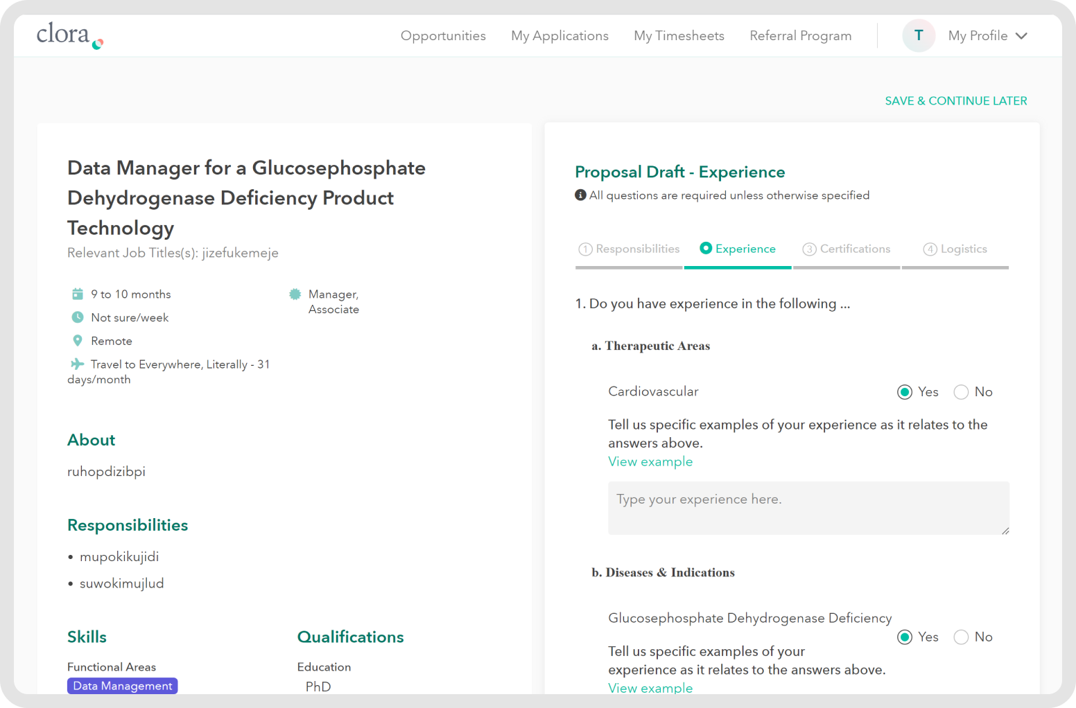
Filling Out Proposals

Users would often write insufficient amounts of information in the proposal sections, this problem could be attributed to having little space to write and a lack of features to help users easily write into proposals that may be repetitive. In addition, the relevant post roles section was easy to miss, and users often felt they had already submitted when reaching the review page. Now, there are several new features to encourage consultants to write more detailed proposals in less time, consultants have the option to adjust what they view including their resume, and previously skipped sections are integrated into the process.
Next Steps & Follow-On Opportunities
Next Steps
Through our research, we prioritized those enhancements that would provide the most immediate business impact. As areas for further improvement, I identified the following:
- Search Bar implementation
- Availability Tracking
- Proactive Outreach
- Additional round of usability testing
